

A product recommendation is only useful when someone can understand it quickly and know what to do next.
Kenneth Fong helped us see where Latitude was falling short. He shared a direct piece of feedback after reading one of our Dashboard recommendations:
"Make the language easier to understand in the platform. I don't want to have to think too hard when using the tool."
The recommendation that prompted his feedback said:
"Clarify how you judge DMs and profile views before calling LinkedIn effective."
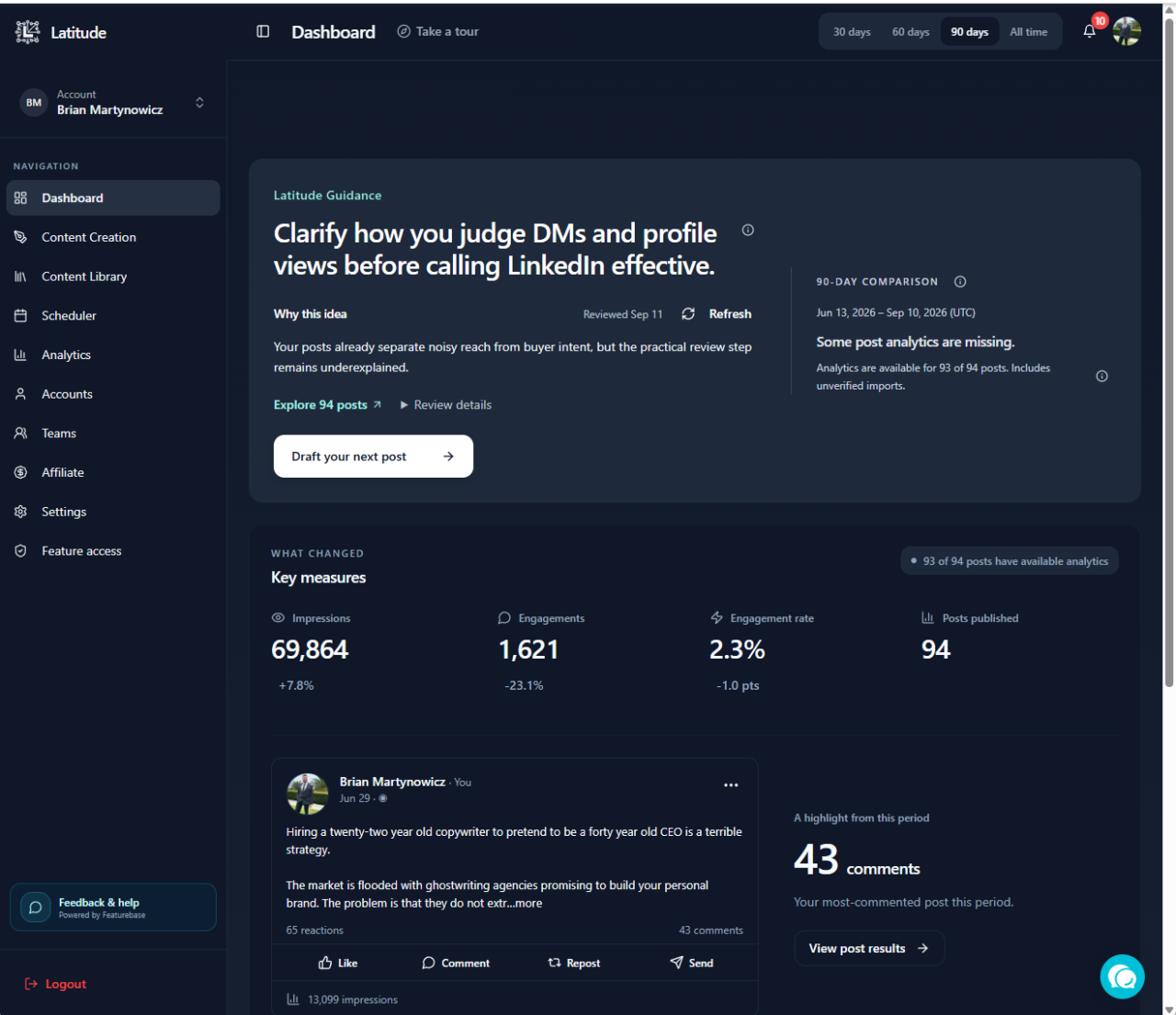
Kenneth was right. The sentence described an idea, but it made the user translate our wording before they could act. It also exposed a broader problem: some parts of the interface and recommendation engine used internal language instead of plain instructions.
Other users had raised similar concerns over time. Kenneth's example gave us the concrete case we needed to address the system behind the wording.
What was wrong with the original recommendation
The sentence mixed three ideas together:
- direct messages
- profile views
- whether LinkedIn is helping the business
It did not explain what Latitude had noticed, what the user should do, or why that action mattered. The user had to unpack the sentence before deciding whether it was useful.
The clearer version is direct:
"Write about how you tell whether LinkedIn is helping your business."
That version gives the user one action. The explanation can then add the evidence and context without forcing all of it into the headline.
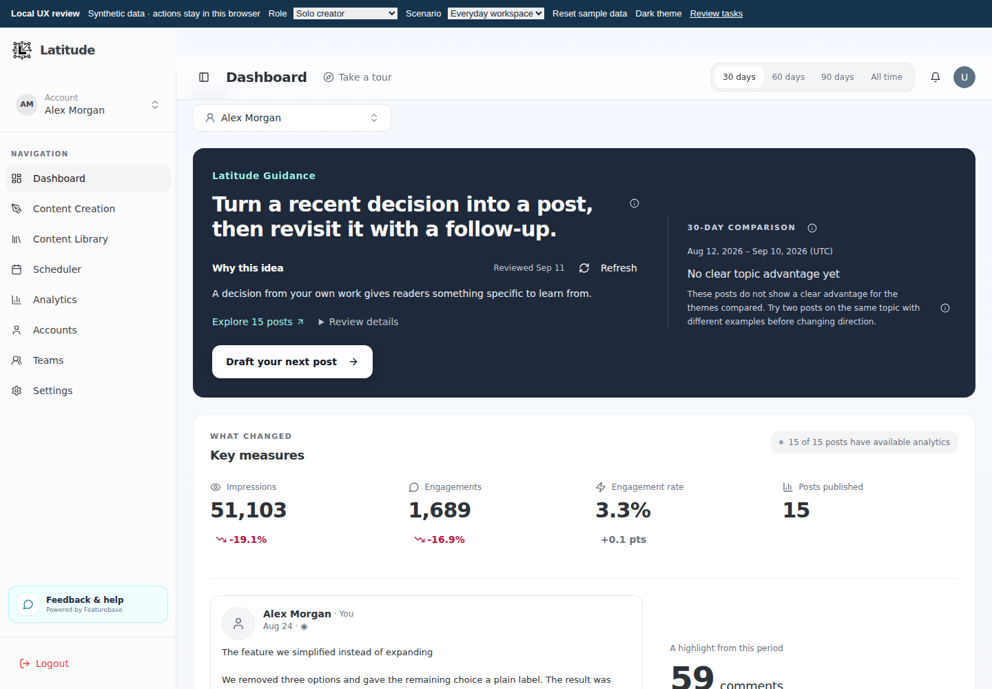
We changed the interface
We reviewed user-facing language across the product and public website, including:
- Dashboard guidance and explanations
- buttons, labels, and tooltips
- analytics notes and missing-data messages
- settings descriptions
- Content Library instructions
- public website copy that explained how Latitude works
We rewrote places where the wording was vague, abstract, or dependent on product jargon. The goal is simple: the next step should be clear on the first read.
The Content Library is clearer too
The language review also covered the Content Library. The earlier version relied on workflow labels such as "Needs review" and left the user to interpret what each state meant.
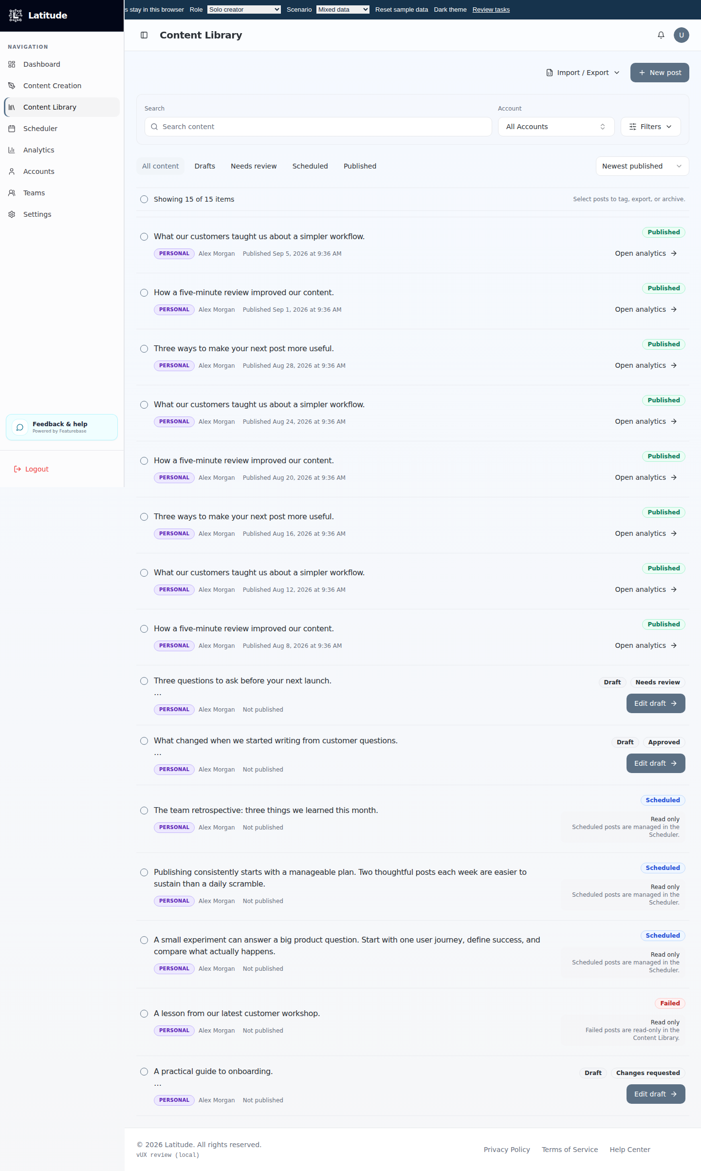
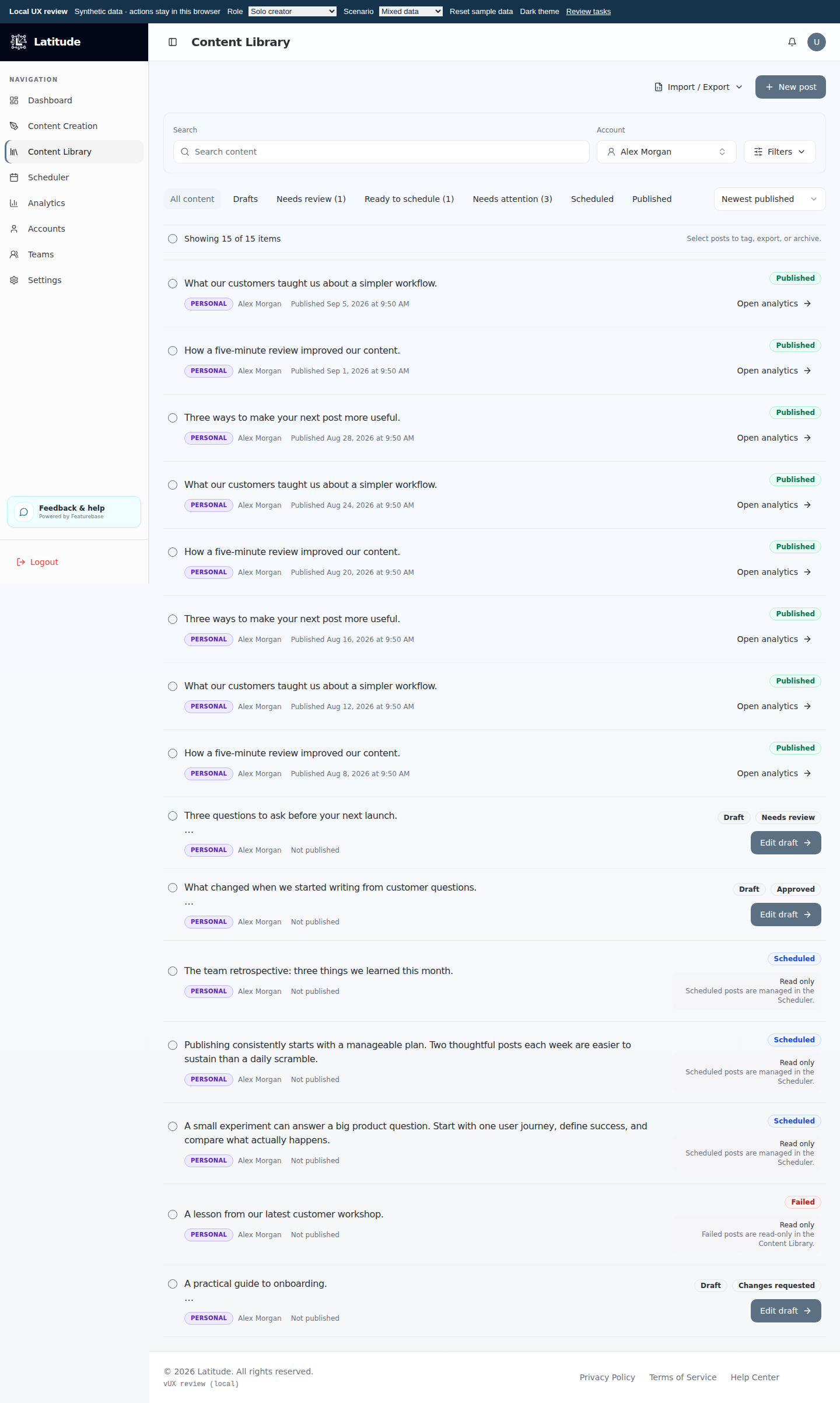
The revised library groups work by the decision a user needs to make: drafts, items that need review, posts ready to schedule, and items that need attention. Each row uses direct actions such as "Edit draft" or "Open analytics," and read-only states explain where the post is managed.
We changed the recommendation engine
Rewriting one sentence would not have fixed the underlying problem. Generated recommendations could reproduce the same pattern in a different form.
Every recommendation now has to separate three things:
- What Latitude noticed in the user's content or results.
- What to do next as one concrete action.
- Why it matters for the user's goal.
We also added quality checks that reject recommendations when they are vague, rely on unexplained acronyms, or pair a headline with an explanation and action that do not match.
This means a recommendation should no longer sound like an internal analysis note. It should read like useful guidance from someone who understands the evidence and respects the user's time.
We tested it with real account data
The change was tested with connected-account data so we could review the variety of recommendations the engine produces, not only a hand-written example.
We checked that:
- the recommendation headline is understandable by itself
- the explanation points to the evidence behind it
- the action tells the user what to do next
- the three parts describe the same idea
- the interface remains readable on desktop and mobile
The updated experience is now live. Dashboard and Content Library access are also available to active paid subscribers and active AppSumo customers.
Customer feedback should change the system
Kenneth did more than flag an awkward sentence. His feedback helped us improve the rules Latitude uses to explain what it sees.
That is the standard we want for customer feedback: fix the example, find the pattern behind it, and make it harder for the problem to return.
Thank you, Kenneth, for pushing us to make Latitude easier to understand.
Visit Kenneth Fong's YouTube channel or watch his Latitude review.
Read the original feature request and release update.
Try Latitude and see the updated guidance with your own LinkedIn data.